Payment of outstanding fees
How I designed the re-enrollment flow, automating financial processes and boosting debt clearance and re-enrollments.
- Squad team Product owner, devs, and I
- Role UI/UX, Researcher, Recruiter
- Tools Figma, Maze
What were the problems?
Before, each re-enrollment was done manually with human contact.
- Low conversion rate
- Needed an operator
- No previous version

Designing the experience
After aligning with the stakeholders and the responsible department, I designed the entire re-enrollment flow, including the part showcased in this case study as well as the back-office configuration section.
Results
We were uncertain if users would understand the difference between choosing Proceed to Payment or Proceed to Negotiation (screen 4 above).
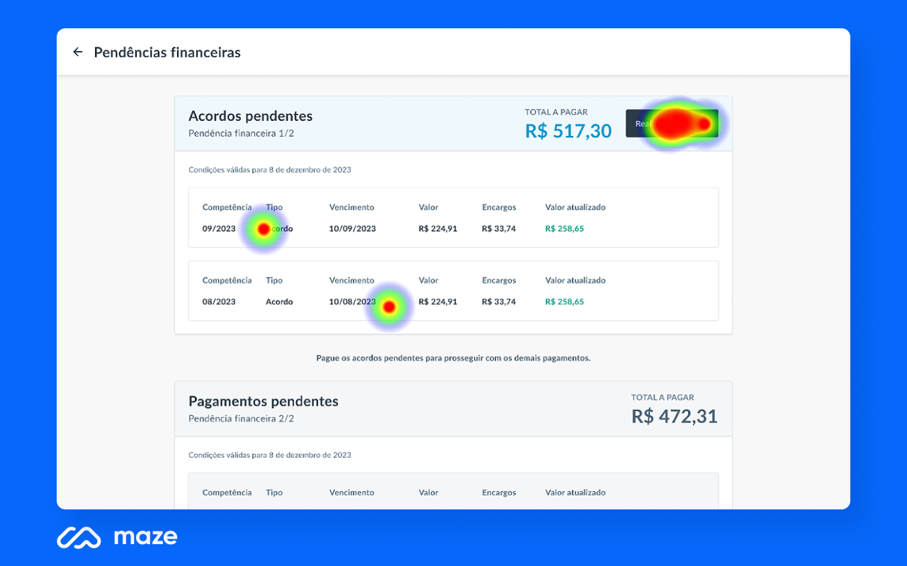
Conducted unmoderated usability test: users completed the re-enrollment flow (screens above) while going through the pending debts screen. One of the post-test questions validated what the journey recordings also indicated: 100% of participants said they felt confident about choosing between Proceed to Payment or Proceed to Negotiation (screen 2 above), and the subsequent page aligned with their expectations from that choice.
However, an unexpected problem arose: in addition to some misclicks, some users reported confusion on this screen due to 2 payment boxes appearing consecutively.
- 13 unmoderated tests performed
- All felt confident regarding screen 4
- Dual boxes led to confusion on screen 2

Proposed solution
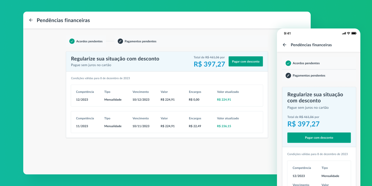
Utilize a step-by-step pattern to avoid confusing users about the existence of 2 separate yet sequential payments.
According to the responsible department, after this feature was implemented, the number of outstanding payments and re-enrollments increased significantly.
